Branding
Product
Reimagining No-code tools
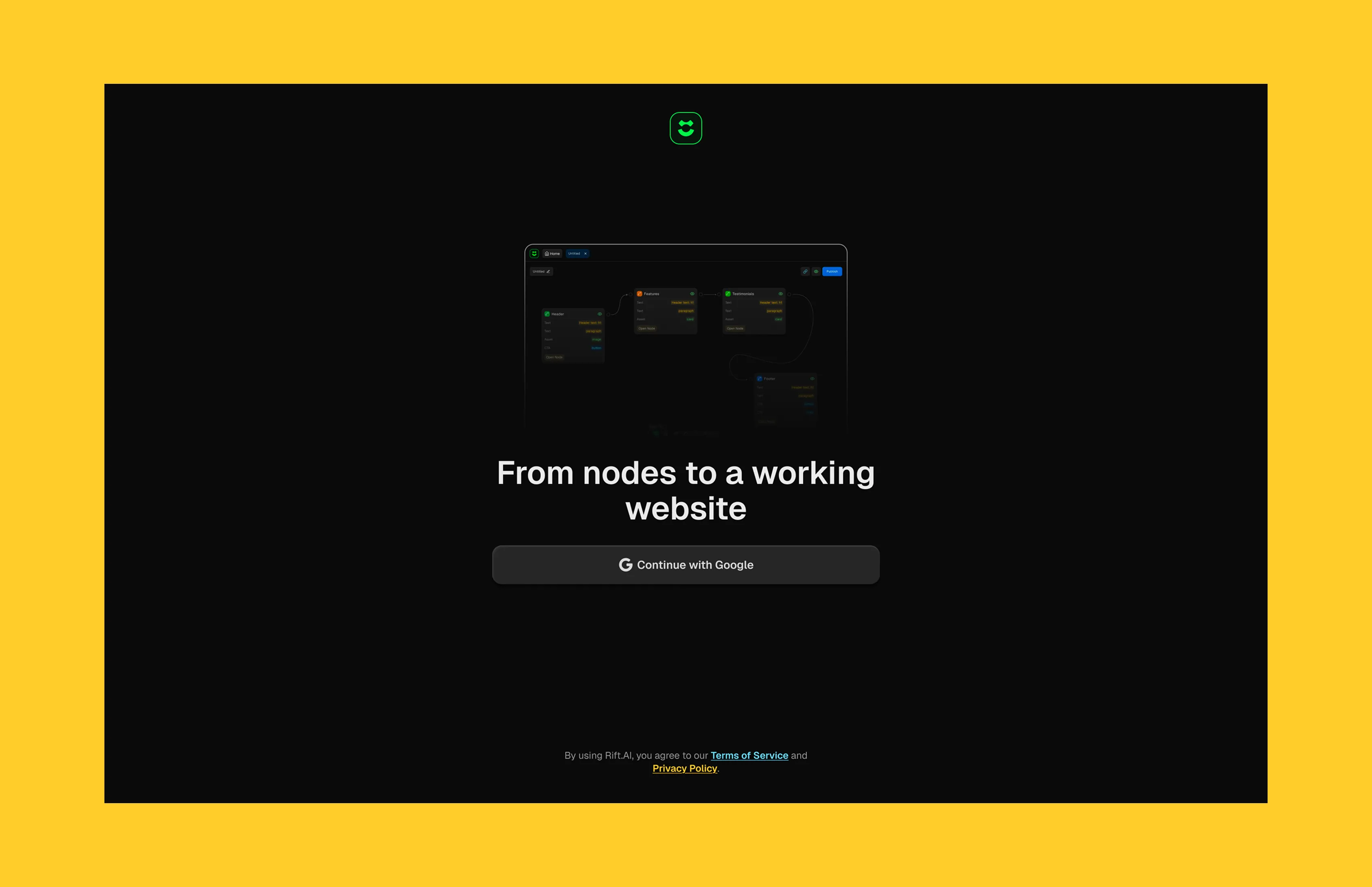
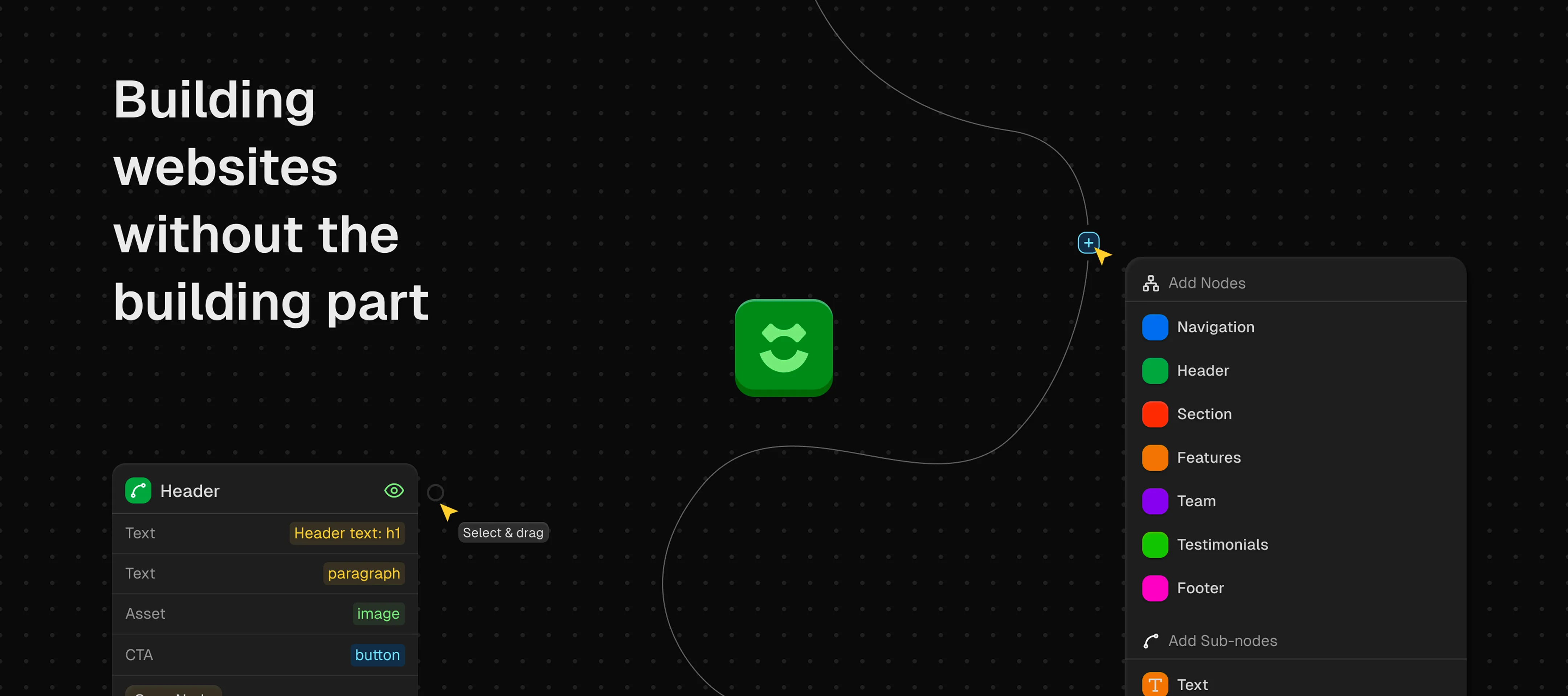
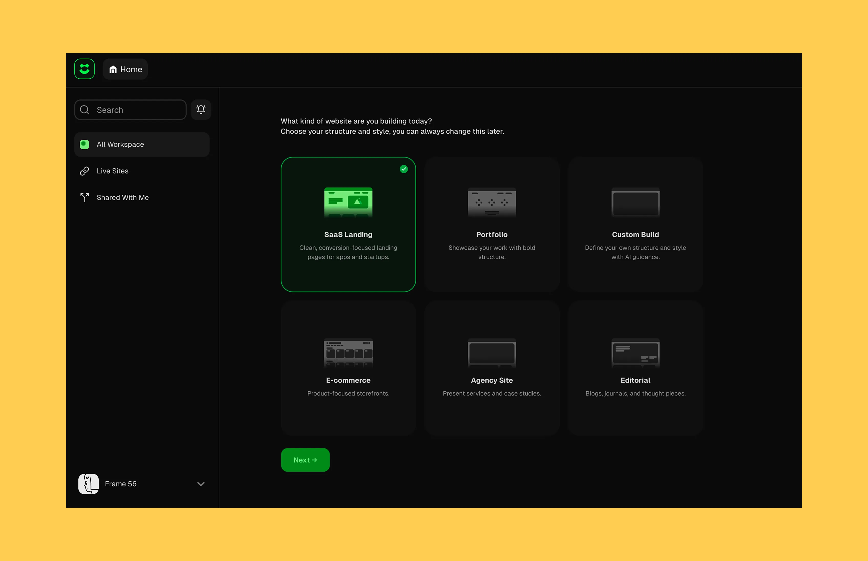
Building websites without the building part
How it happened
The Approach
The Design Challenge
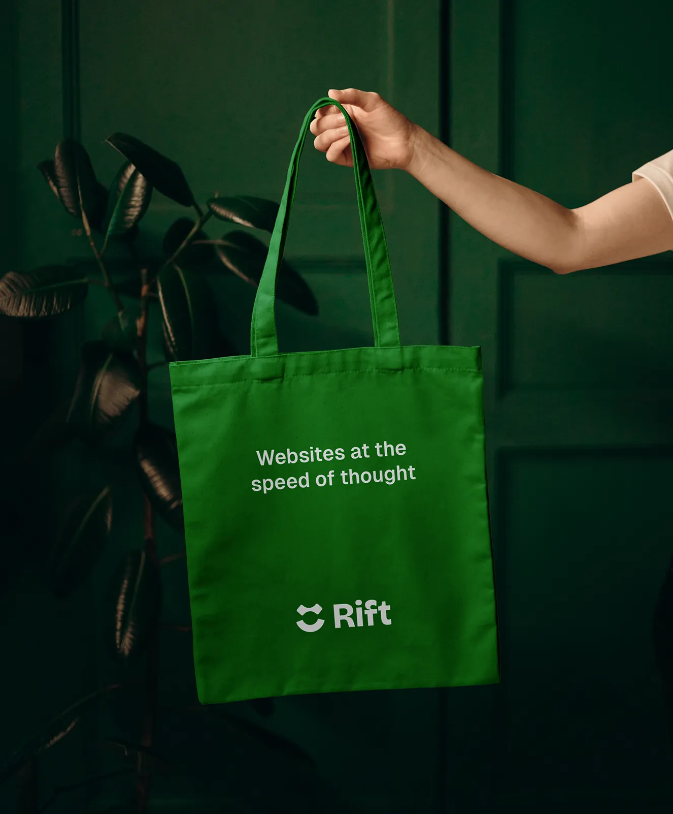
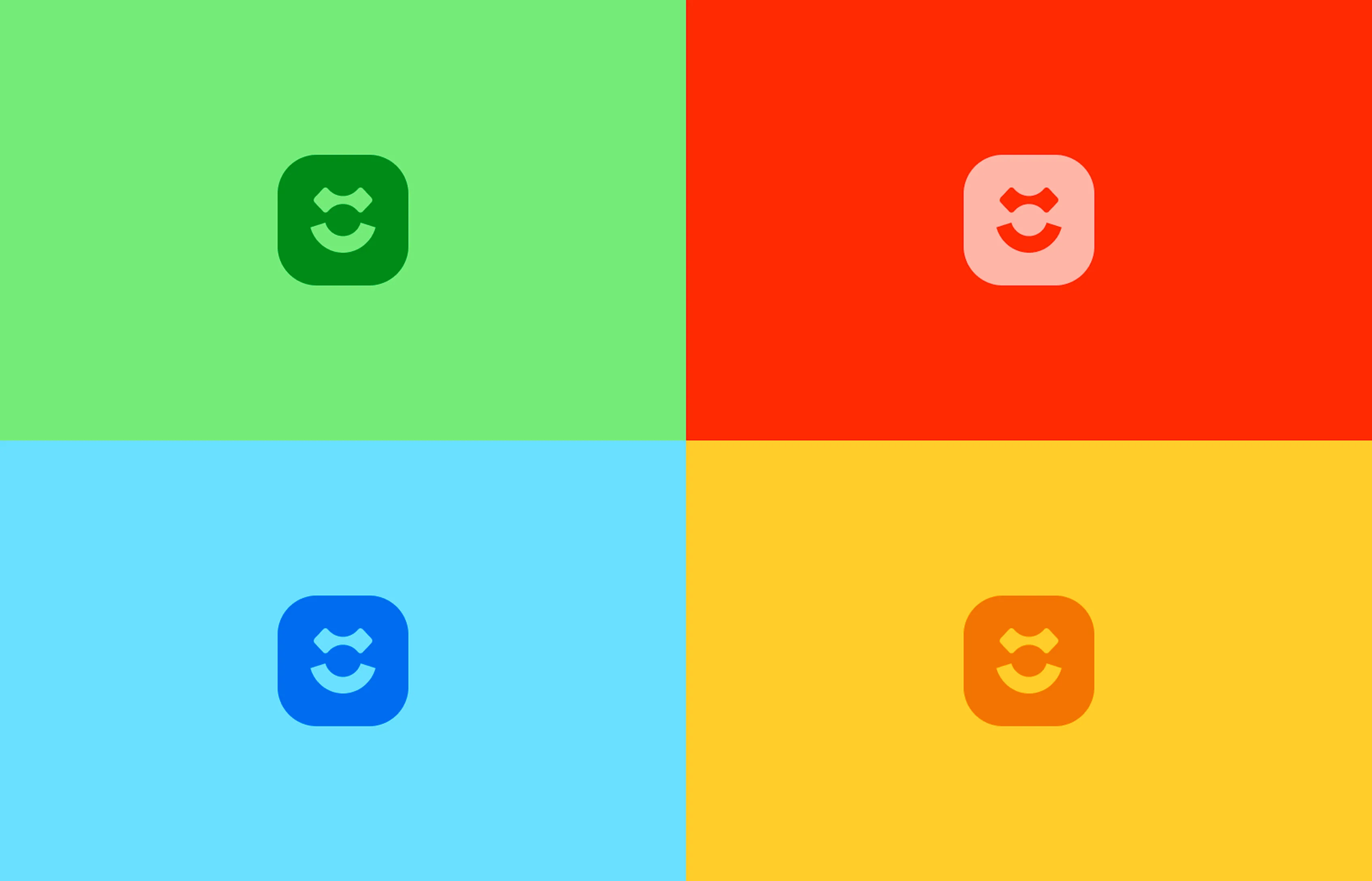
The Brand
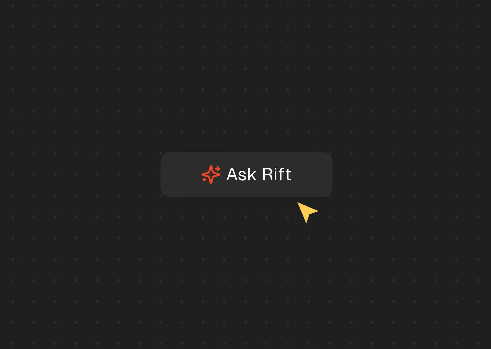
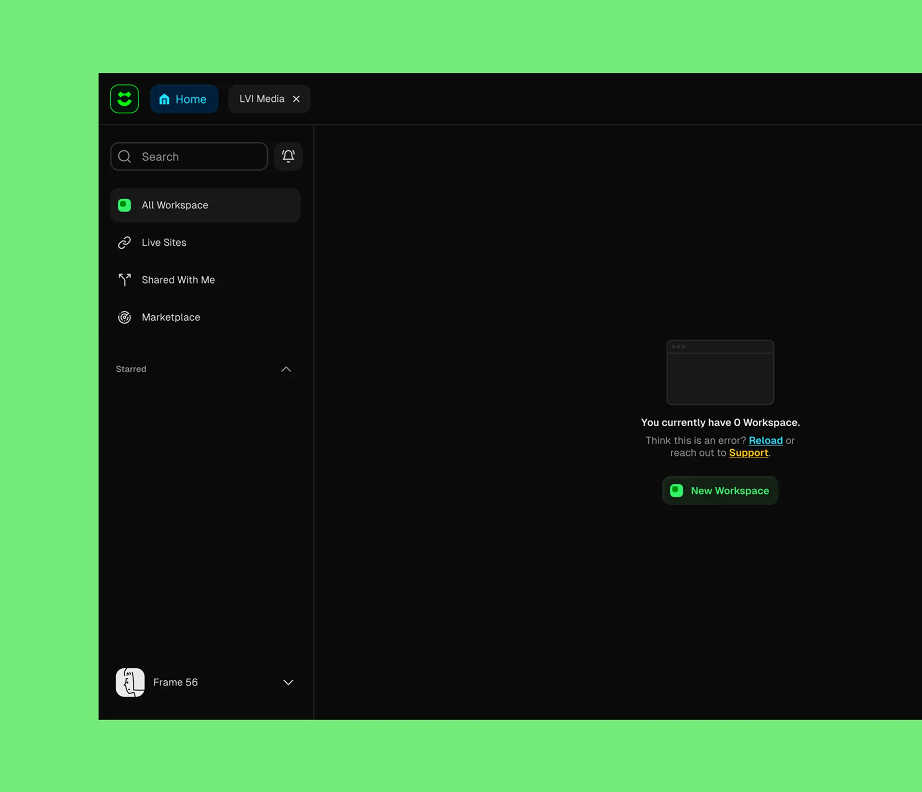
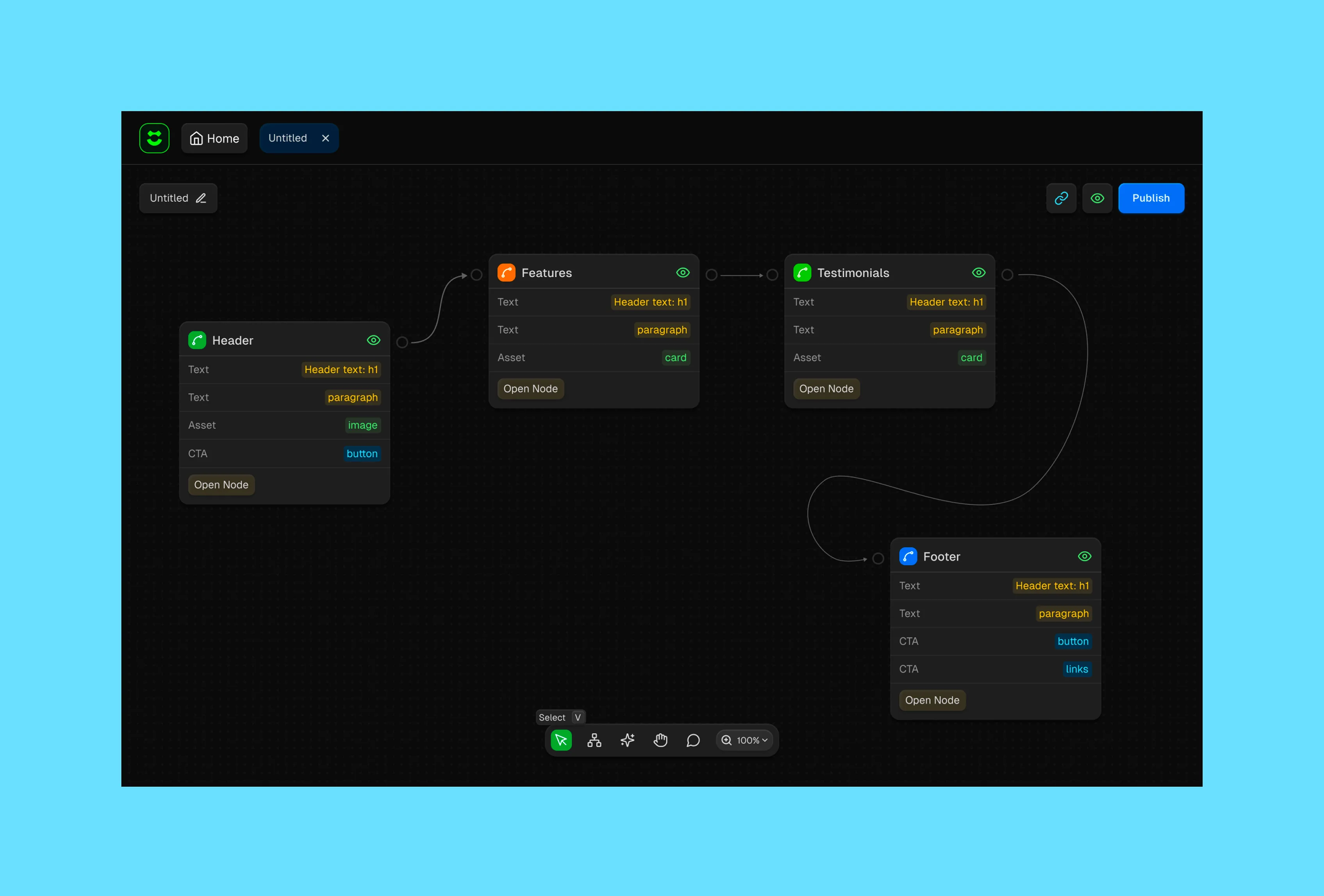
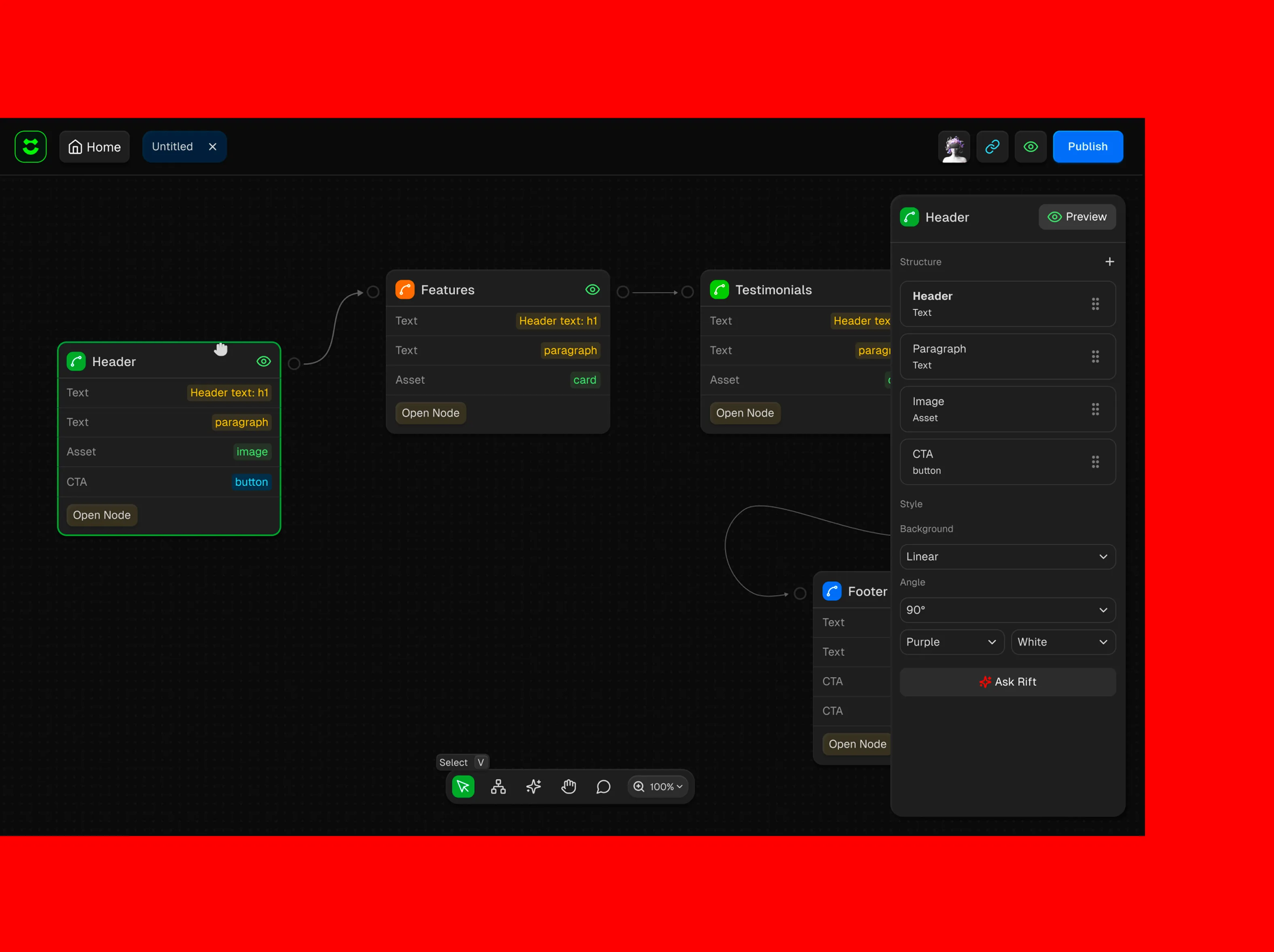
The Product
What Made It Work
PMs could finally test ideas at the speed of thought. Founders could build landing pages without hiring an agency. People who'd never touched design software could make things that didn't look embarrassing.
What We Learned
Constraints can be gifts. Not being able to show projects forced us to think differently about what a portfolio site could be. Instead of documenting past work, we demonstrated how LVI works through the experience itself.
Also: energy is transferable. A website can embody the qualities of the company it represents. LVI is fast and bold, so we made a site that feels fast and bold. That coherence between brand personality and digital experience is what makes people remember you.
Sometimes the website is the portfolio.