Parallel Lab LogoSay Hello
Loading...
00%
Parallel Lab
PL'25

Website

A portfolio site with no portfolio

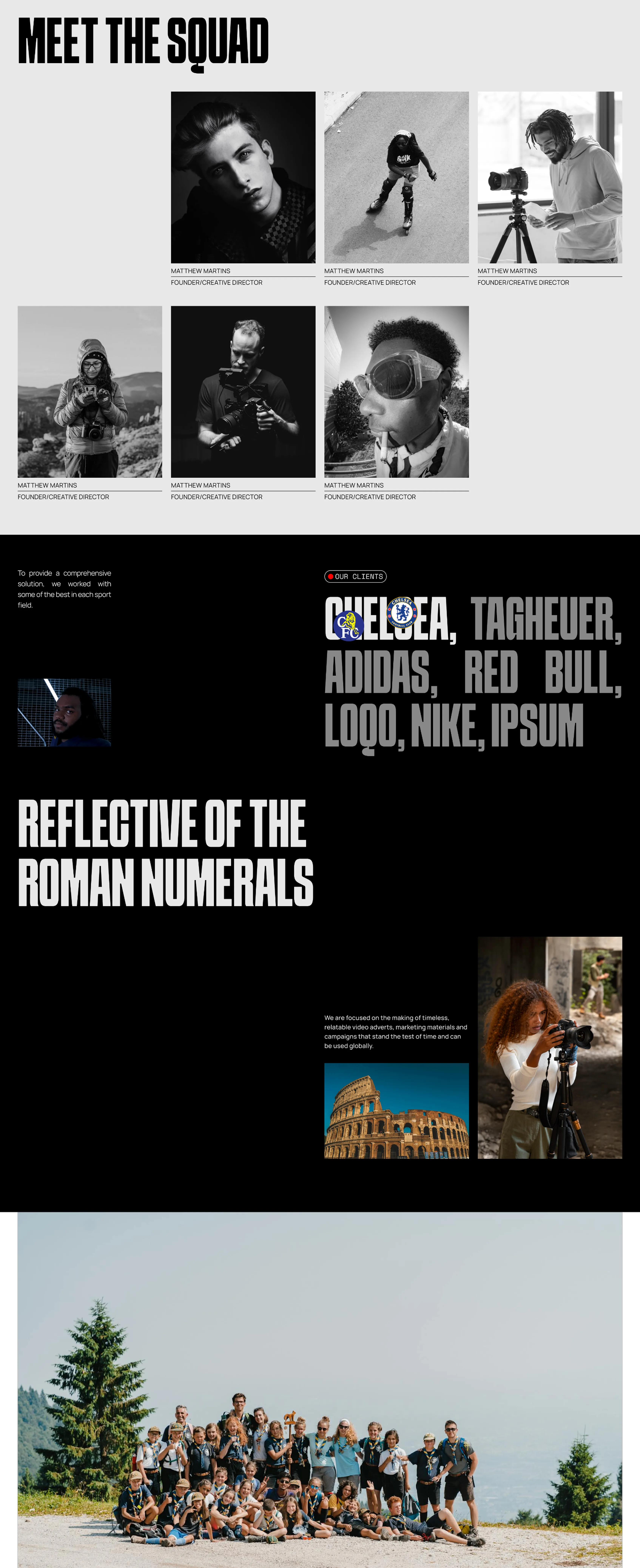
Making LVI Media appear as the top sports production studio, without showcasing any of their actual work.

LVI Media

How it happened

LVI Media had been producing sports content for years—brand films, athlete profiles, event coverage—but they were operating without a real brand identity.


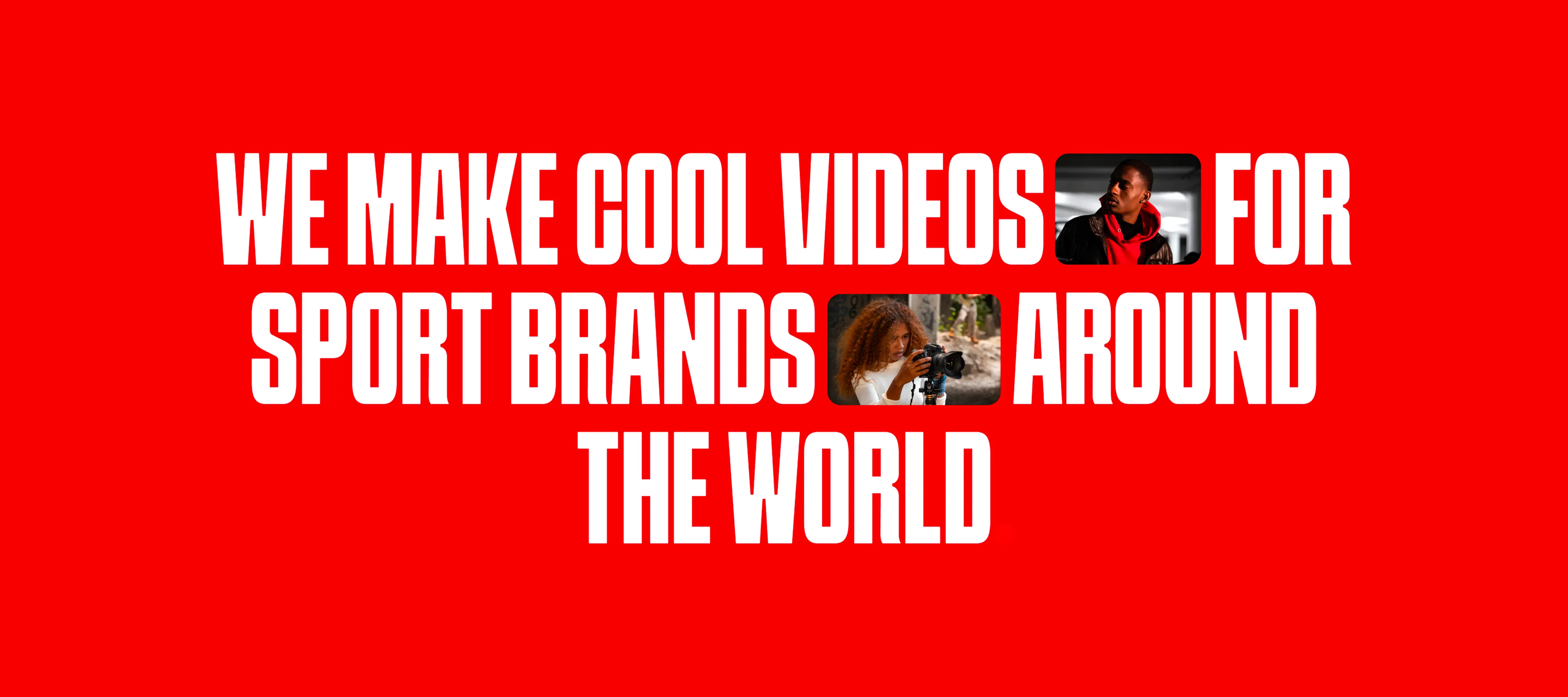
So when they told us they need a new face, they had an impossible brief: make us look like the best sports production studio you've ever seen, but you can't show any of our actual work.


Just a logo grid of clients and a prayer that brands would take them seriously.

What Makes LVI Different

Here's the thing about sports production: the work speaks for itself, but only if brands actually find you and take you seriously. LVI was competing against larger studios with established reputations and slick branding.


Their work speaks for itself, but only if brands actually find you and take you seriously. LVI was competing against larger studios with established reputations and slick branding. They needed to punch above their weight.

What made LVI special was speed. Not just quick-turnaround fast, but agile—they could pivot mid-shoot, adapt to athlete schedules, capture moments other studios would miss because they were too locked into pre-production plans. They were improvisers in the best way.

The challenge was communicating that agility and energy without being able to show a single frame of footage.

LVI Media design process

The Constraint That Changed Everything

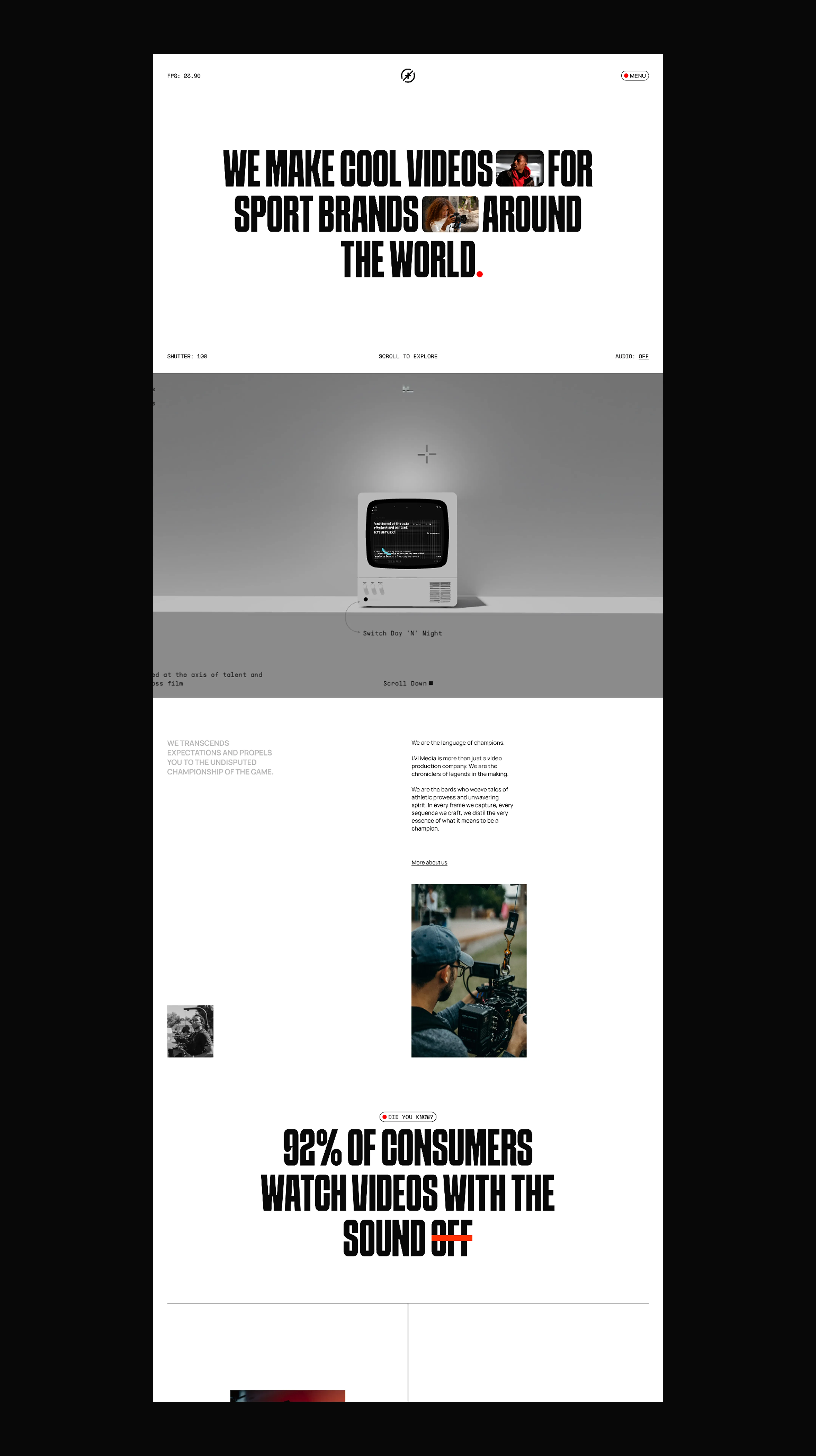
Most portfolio sites live or die by the work they showcase. We didn't have that option. So we had to make the website itself do the heavy lifting.


If LVI's strength was being fast and adaptive, the site needed to feel fast and adaptive. Not just load quickly—actually embody the energy of how they work.

We decided the site itself would be the portfolio piece.

What
We Built

Bold, Unapologetic Energy

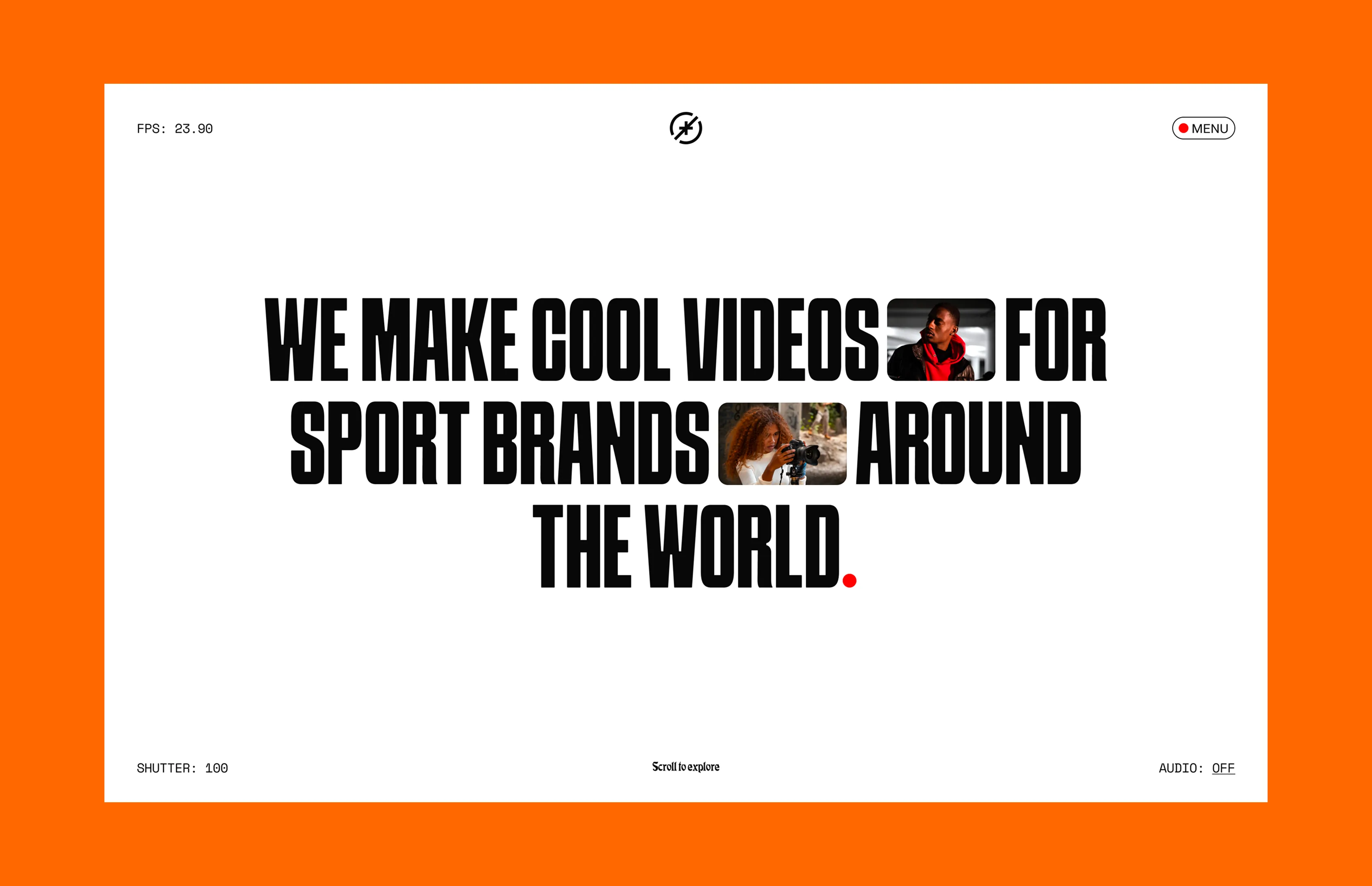
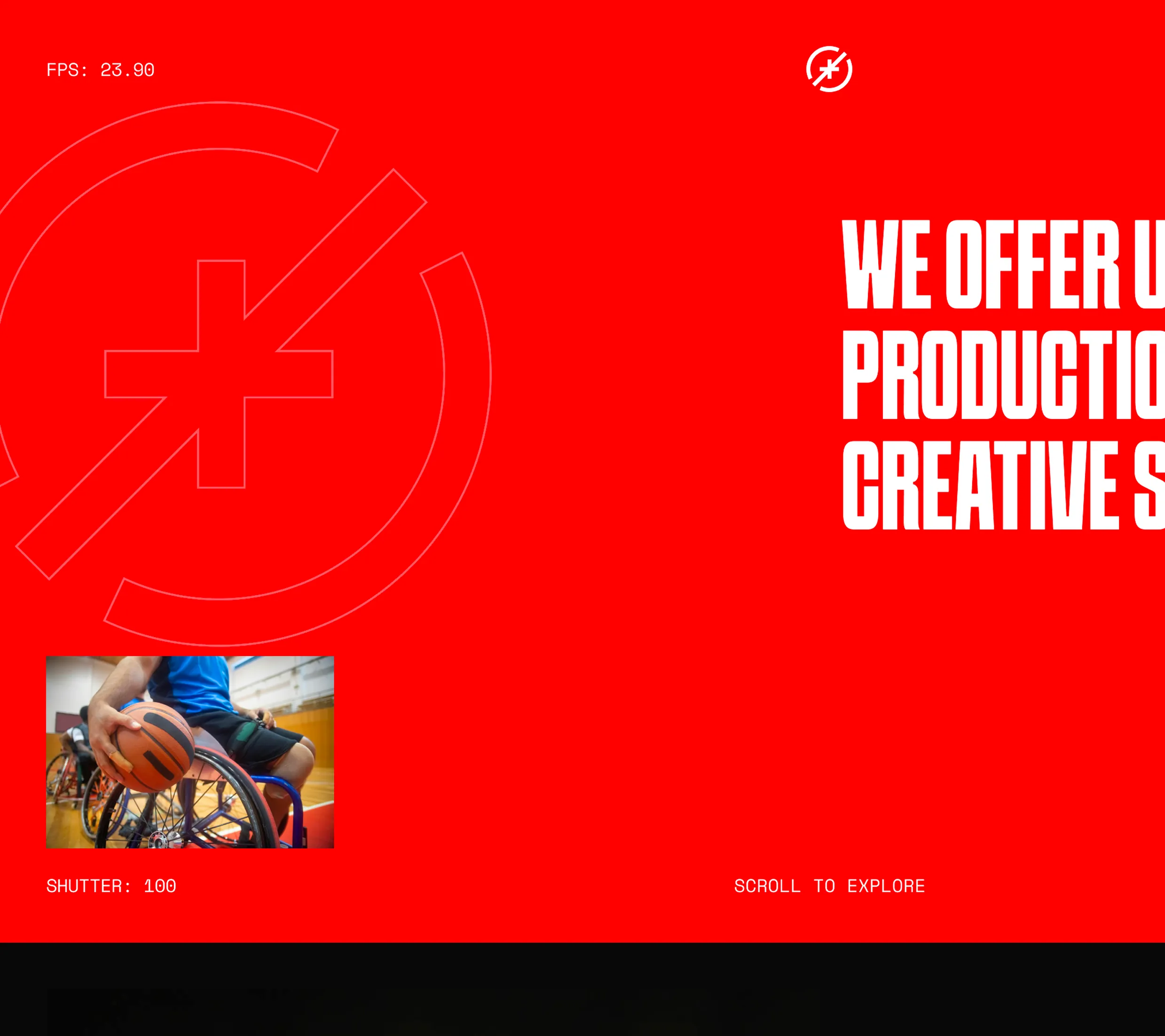
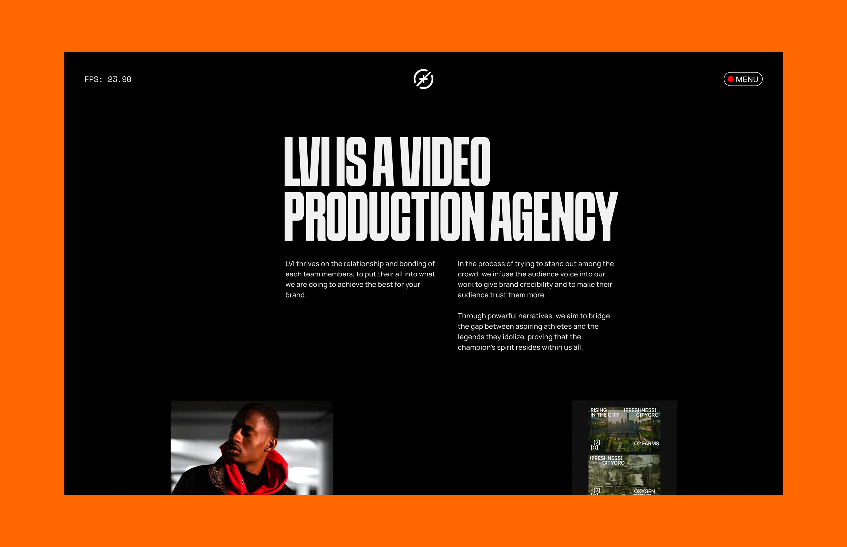
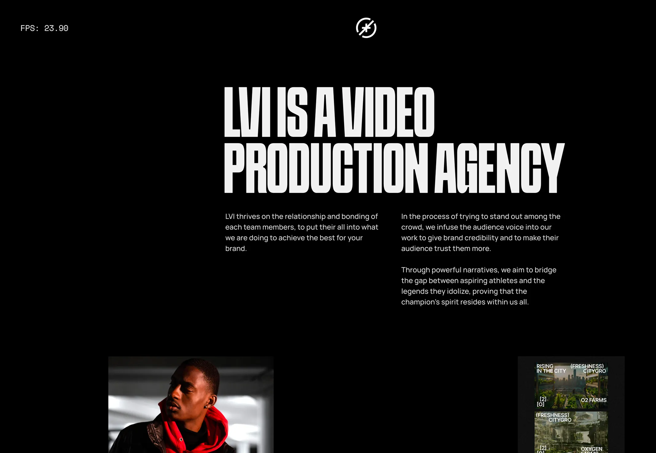
The brand color—that vibrant orange—became the foundation. It's loud, confident, impossible to ignore. Exactly how LVI needed to show up in a crowded market. We used it everywhere, no apologies.


The logo has this dynamic slash through it, suggesting movement and disruption. It's a mark that feels like it's already in motion.

Minimal Copy,
Maximum Impact

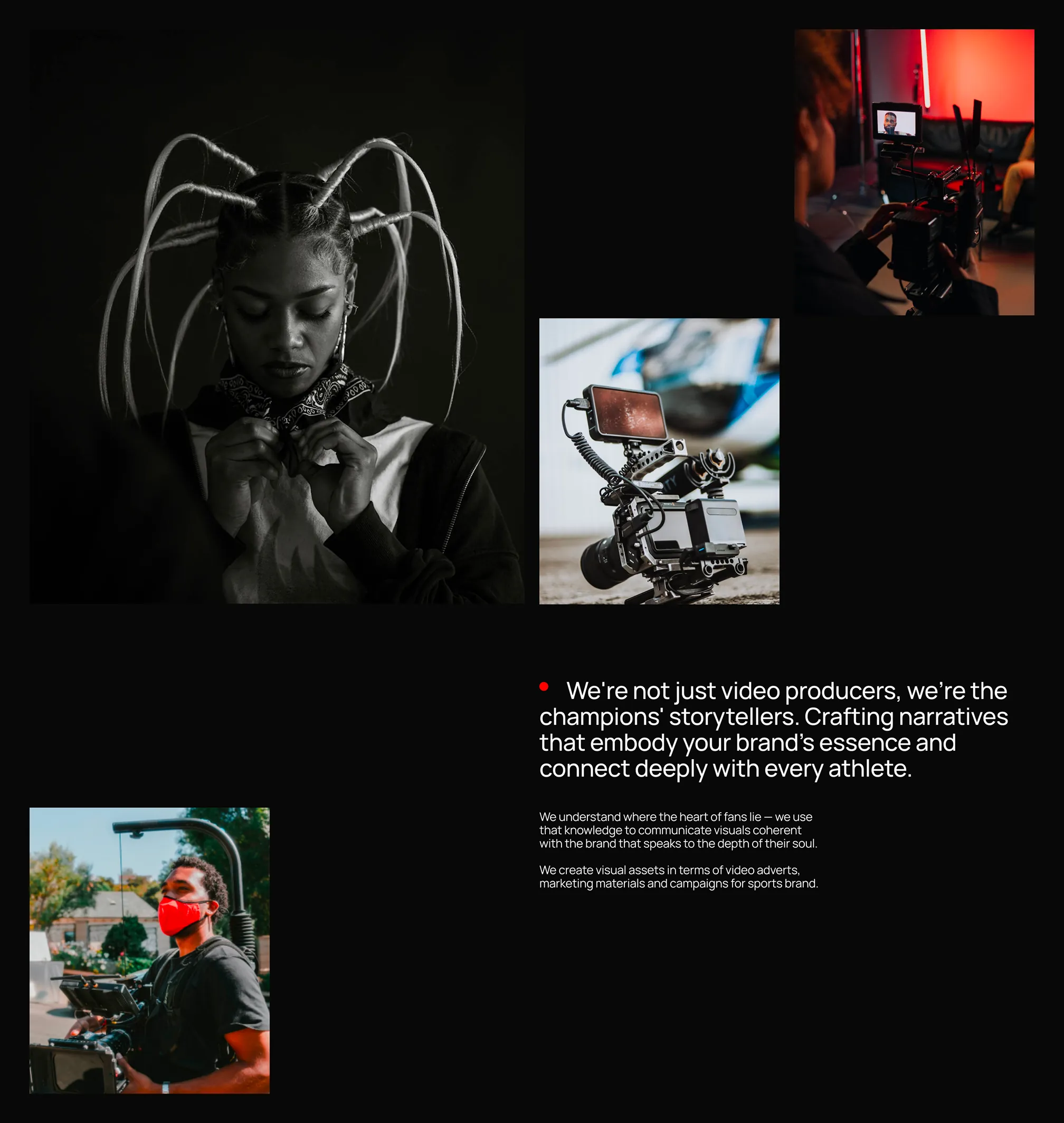
We couldn't lean on case studies or project descriptions, so every word had to work harder. Short, punchy statements about what LVI does and how they do it differently. No fluff. Just confidence.

The Outcome

LVI went from competing for attention to commanding it. The site positioned them as a premium studio that could hang with anyone, even without showing a single project. The design did what the portfolio couldn't.


Bigger brands started taking meetings. Teams that had worked with legacy studios for years started asking about LVI. The website gave them credibility they couldn't buy with a showreel.

What We Learned

Constraints can be gifts. Not being able to show projects forced us to think differently about what a portfolio site could be. Instead of documenting past work, we demonstrated how LVI works through the experience itself.

Also: energy is transferable. A website can embody the qualities of the company it represents. LVI is fast and bold, so we made a site that feels fast and bold. That coherence between brand personality and digital experience is what makes people remember you.

Sometimes the website is the portfolio.

Next Project  →